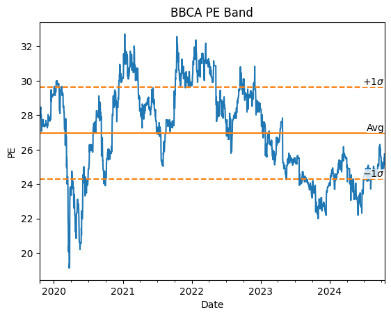
Equity analysts often use a tool called “PE (price to earnings ratio) bands”, which plots a stock’s time series PE and compare it with the historical mean and standard deviation. Here’s an example PE band for BBCA stock:

The idea is to assess the stock’s valuation relative to its historical valuations. For example, if the PE is “below -1 standard deviation” (which is a short-hand for “below the mean minus 1 standard deviation”), then the analyst might conclude that the stock is currently cheap by historical standard, and might have potentially high upside.
This style of analysis is not without problems. For example, if the PE is below -1 standard deviation, without any other information it is impossible to know if the stock is really “cheap” or it is actually being de-rated by investors.
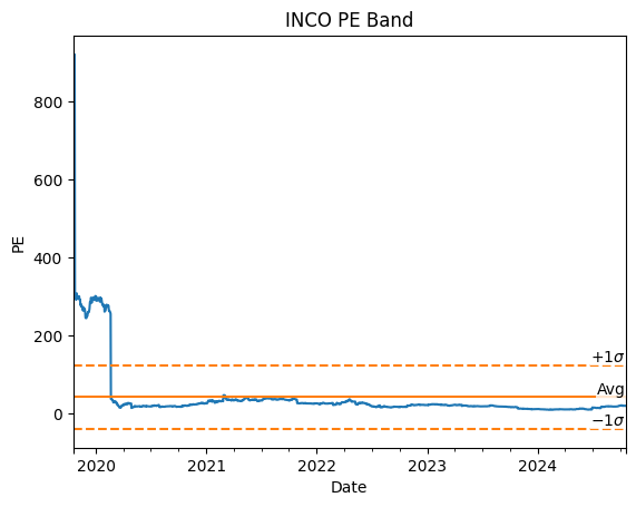
One problem that I want to address in this post is the fact that mean and standard deviation are known to be easily distorted by extreme values in the data. Here’s an example PE band for INCO stock:

In the chart above, because of extremely high PE ratios in the 2020 period, the PE band became very high and very wide. The extremely high PE ratios usually happened during periods of very low earnings, which caused the PE ratio to explode. Since these periods rarely happen, using the conventional method of creating the PE band might not be accurate.
What I usually do to alleviate this problem are as follows:
- Use the median instead of the mean
- Use “IQR standard deviation” or “MAD standard deviation” instead of the conventional standard deviation
IQR standard deviation is calculated as follows1:
\[\sigma_{\text{IQR}}(x) = \text{IQR}(x) / 1.349\]where IQR is the interquartile range, which is calculated as the difference between the data’s 75th and 25th percentile. Here’s how to retrieve $\sigma_{\text{IQR}}$ using BQL:
=BQL(<ticker>,"(quantile(#pe,0.75) - quantile(#pe,0.25))/1.349","#pe=pe_ratio(dates=range(-5Y,0D))")
Another measure that you can use is “MAD standard deviation”2 (“MAD” stands for median absolute deviation):
\[\sigma_{\text{MAD}}(x) = \text{median}(|x - \text{median}(x)|) / 1.4826\]I found that stocks with periods of extremely high PE tend to have lower $\sigma_{\text{MAD}}$ compared to $\sigma_{\text{IQR}}$, which in my opinion is better.
Using BQL in Excel, it is easy to retrieve $\sigma_{\text{MAD}}$:
=BQL(<ticker>,"median(abs(#pe-median(#pe)))/1.4826 ","#pe=pe_ratio(dates=range(-5Y,0D))")
Below I compare the PE bands created using conventional method vs the robust methods for BRIS stock:

Let’s zoom in a little:

As you can see, the robust method results in much more reasonable PE bands compared to the conventional method. Moreover, as I have stated, the MAD method results in narrower band than the IQR method.
Below are the PE bands for INCO stock:

Let’s zoom in a little:

Once again, the robust method results in much more reasonable PE bands. Using this method, I become more confident that the PE bands are less affected by extremely high values in the data.
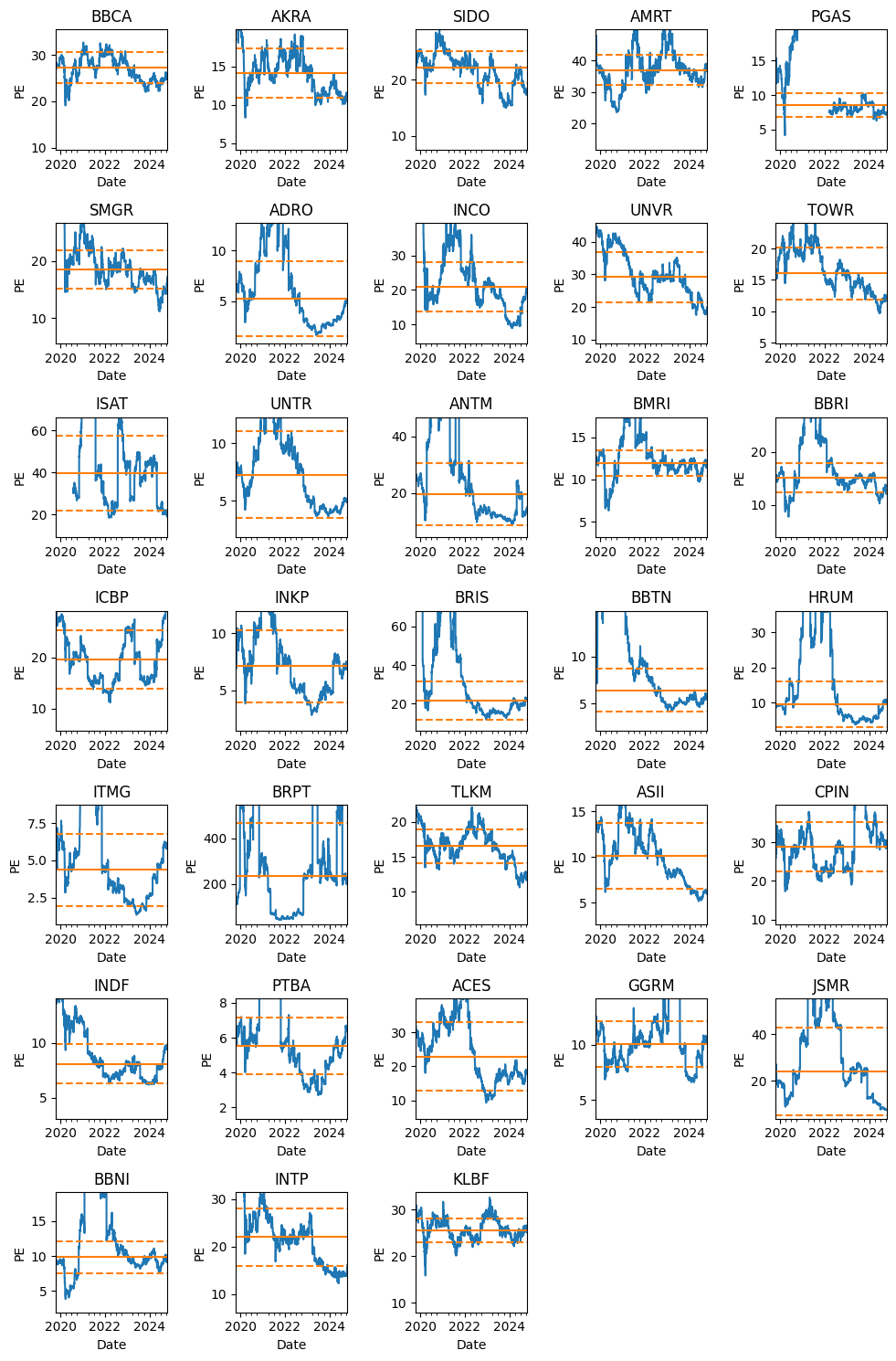
For further illustration, I have created the PE bands for various Indonesia’s stocks (using MAD method):

That’s it for this post. I hope you learn something new.
Notes:
- All PE data shown in this post are retrieved from Bloomberg. I used the trailing 12-month earnings data as the denominator.